
Atlanta's Peer Metros in Housing Stability: Black Population Percentage

Throughout our journey so far, there has been a clear pattern where Atlanta’s peer metros have shown themselves to be rather loosely tied to Atlanta. This sense of looseness stands out even more when comparing the relationship between Atlanta and its peer metros with Louisville and its peers. And the reason for this is Metro Atlanta’s unique combination of overall population size, the size of its Black population, and its socioeconomic measures. Out of these three characteristics, the one that is toughest for other metros to match is Atlanta’s Black population percentage.
The graph below makes it crystal clear that the metros that demonstrate a good deal of alignment on other measures, simply don’t come close to the Atlanta MSA’s Black percentage number. The metro that is closest to Atlanta in this respect is more than 12 percentage points away. The total range for this metric is 17 points, which is more than 3-times the range found for Louisville and its peers on this metric. Atlanta’s overall closest peer is more than 13 points away from Atlanta’s 33.5 percent. The peer metro with the most distant Black percentage value is Atlanta’s third-closest peer on the final list. The one with the closest Black percentage is fifth on the list of Atlanta’s closest peers.
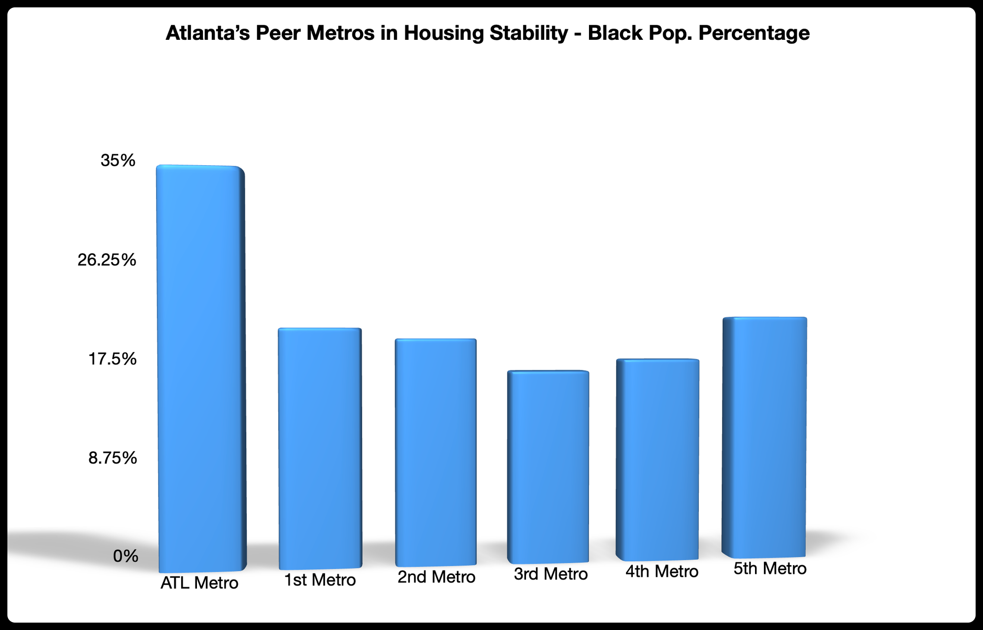
All evidence suggests that the relatively large distance between Atlanta and its peer metros is driven primarily by the Black percentage difference. This comes into sharper relief when we factor in the metros that are in Atlanta’s top-20 closest metros and within 5 percentage points of its Black population number. The Baltimore MSA stands out as a metro that came close to cracking the top-5 with a 28.6 Black population percentage. The metric that kept it from making the top-5 was its MSA population number, which is over 1M people below the MSA with the lowest population number in the top-5. The Virginia Beach MSA (29.3 percent Black), which ranks #16 on the list, is similarly positioned. All of its numbers are within the same range as Atlanta’s top-5 closest metros, with the notable exception of the MSA population number, which is even lower than Baltimore's.
All of this speaks to the merits inherent in basing MSA proximity solely on the data. When each measure is given equal weight and overall proximity is based on the degree that metros relate to one another across these equally weighted measures, these are the results that we get.
We cannot wait to dig further into these findings and share the actual names of Atlanta’s truest peers. Be sure to subscribe to be a part of the big reveal and to witness the benchmarking process.