
Atlanta's Peer Metros in Housing Stability: Population
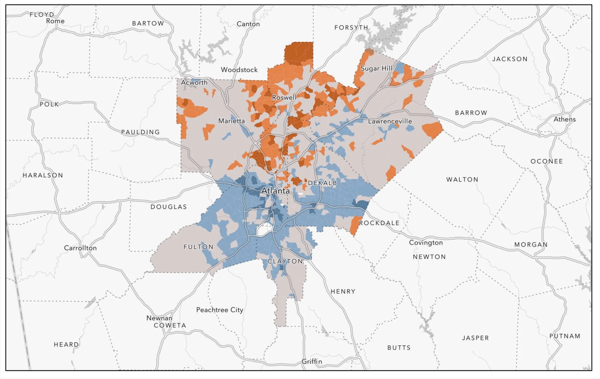
I have dedicated more than a little time to Metro Atlanta neighborhoods, so with the release of new census data I plan to seize the chance of moving forward with the fruits of what I've learned and adding new elements to help shed further light. My first step was identifying the metro areas that are in closest proximity to Metro Atlanta. As I discussed in a recent post, it took time and polish, but I eventually found these metros. Given the size of Atlanta, most people will be well familiar with these cities, so I look forward to sharing more about these metros and how they all compare to one another.
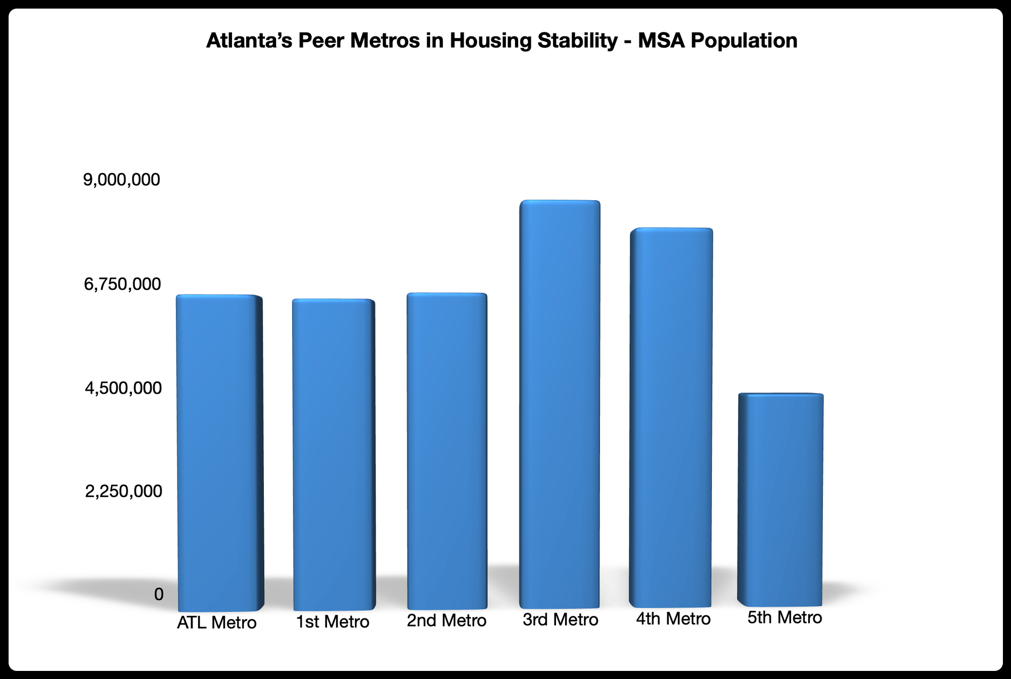
Speaking of size, the first metric out of five that I used to identify Atlanta's peer metros was the total population within the MSA. Unlike the Louisville case where the metro that was closest to its population number ended up being just its second closest peer, in the case of Atlanta, its closest peer and the metro closest to its population number are one and the same (see the graph below). However, this graph also foreshadows the extent that MSA population is an important factor in identifying a peer metro without being determinative. We can see from the graph the metros that were the third and fourth closest to Atlanta had substantially higher population numbers, while the fifth closest metro had a significantly lower population number.
Next up we'll explore a metric that is more directly tied to housing stability. Until then, be sure to subscribe with us to gain full access to the big reveal and the data, insights, and analysis that will accompany the reveal.