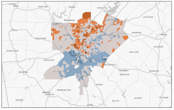
Metro Atlanta's Five Neighborhoods: Fully Advantaged Neighborhoods
One of the top three ethics that disciplines researchers is following where the data takes you. So far, we have journeyed through the facts and figures tied to four different neighborhood types found in Metro Atlanta. Each neighborhood type has been defined by the degree that the neighborhoods under their umbrella have socioeconomic statistics that surpass or fall under the same statistics at the Metropolitan Statistical Area (MSA) level. Categorizing neighborhoods and neighborhood types in this way has provided a unique angle of analysis that for all its limitations—has shed some light on neighborhood inequalities, racial/ethnic dynamics, geographic patterns, and how all of these elements interweave.
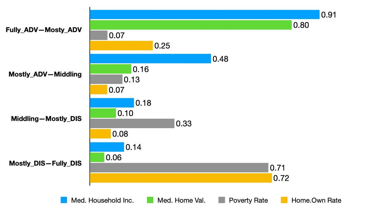
Bringing this new data into the mix has challenged me. As neighborhoods with socioeconomic statistics that surpass the MSA-level on each of the four metrics, the inclusion of fully advantaged neighborhoods exposed something. Given how the analysis has been flowing to this point, I did not anticipate finding a distance score between neighborhood types wider than the one we found between mostly disadvantaged and fully disadvantaged neighborhoods. Lo and behold, the distance between fully advantaged and mostly advantaged neighborhoods turns out to be widest of them all (see the graph below). This finding suggests that when it comes to the interwoven relationship between neighborhoods, the residents who live there, and the ways in which neighborhoods are economically valuated— the neighborhood lifeworlds that are most separate from counterpart lifeworlds are found at the opposite ends of the spectrum.
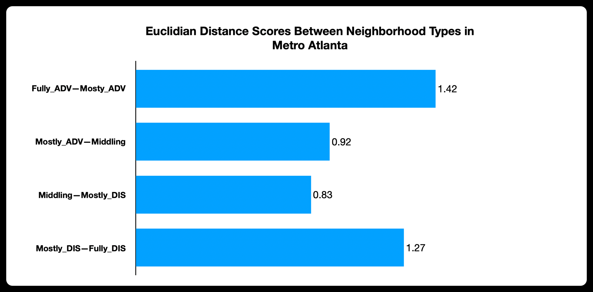
Considering this dynamic further, I am compelled to point out that 16.6 percent of Metro Atlanta households lived in fully advantaged (FL_ADV) neighborhoods, while 23.2 percent of households lived in fully disadvantaged (FL_DIS) neighborhoods. This translates to 39.8 percent of Metro Atlanta residents living in neighborhood conditions that are noticeably distinct from other neighborhoods in the metro area. Of course, these are quite different types of distinct, but distinct nonetheless. It will take further research to confirm what these findings seem to suggest and wrestle with what this means for the social fabric of a growing metropolis.
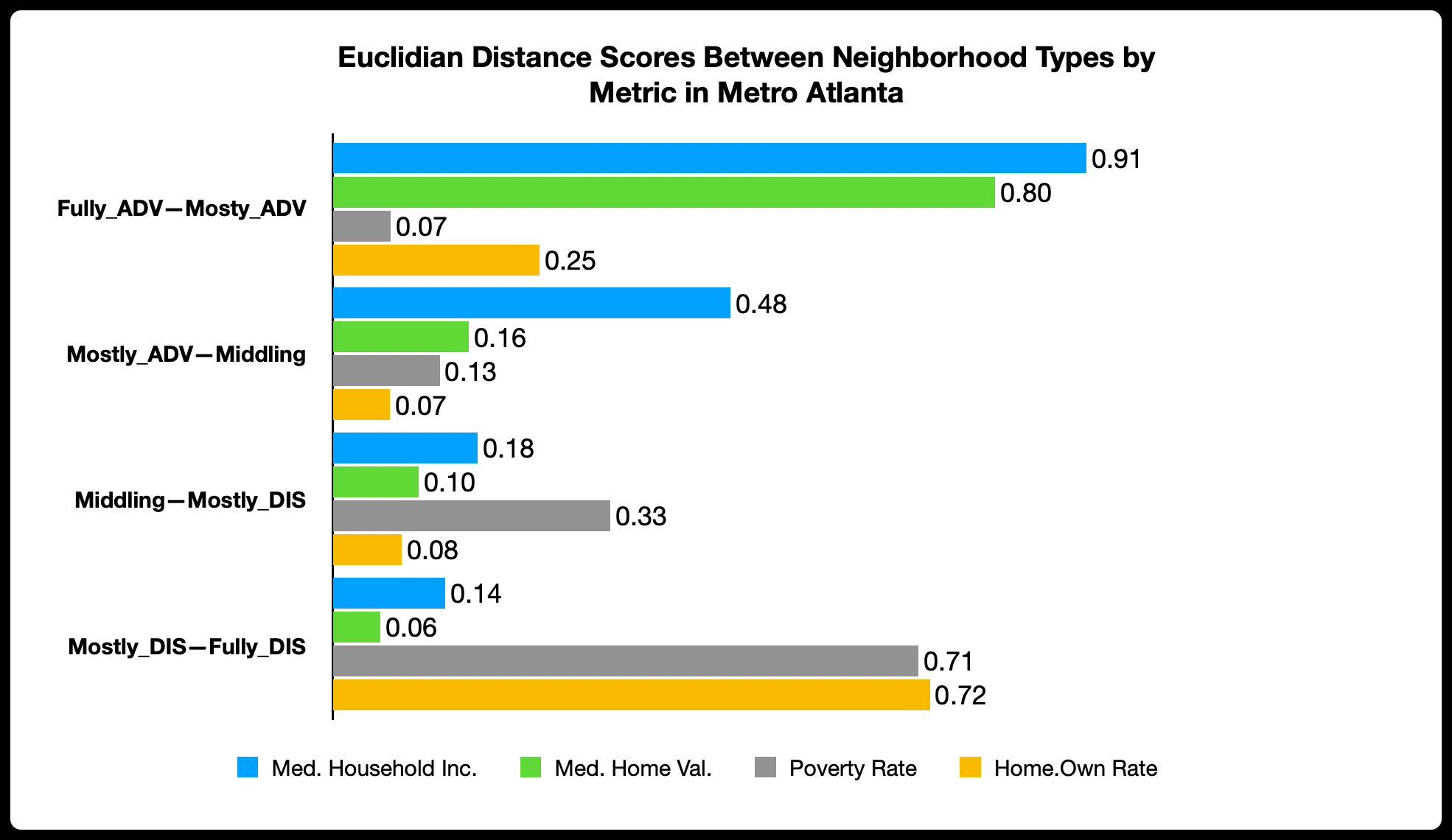
The graph above shows which metrics are driving the distance scores. In the case of the wide gap between FL_ADV and mostly advantaged (MST_ADV) neighborhoods, it is clear that median household income and median home value differences are the main drivers. It is illustrative that these household wealth-related metrics separate both classes of advantaged neighborhoods, while the measures that are less tied to household wealth (poverty rates and homeownership rates) drove the gap between both types of disadvantaged neighborhoods.
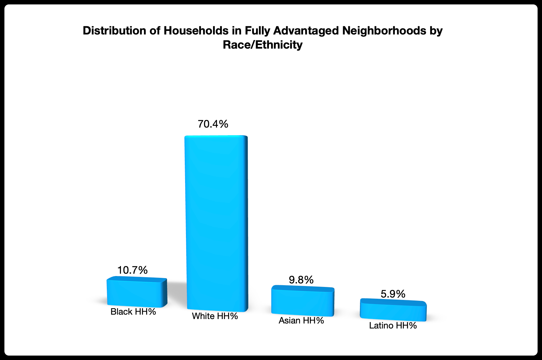
The difference between the racial/ethnic demography of FL_ADV and MST_ADV neighborhoods is just as dramatic as the socioeconomic differences. The table below shows that White American households made up 70.4 percent of FL_ADV neighborhoods, on average. This is a sizable increase from the 56.8 percent of White households found in MST_ADV neighborhoods. This 13.6 percent increase in representation mirrors the 14.5 percent decrease in representation for Black American households. While 25.2 percent of the households in MST_ADV neighborhoods were Black, their representation drops to 10.7 percent in FL_ADV neighborhoods. This finding makes it clear that even in Metro Atlanta the all too familiar pattern of Black Americans being overrepresented in economically disadvantaged neighborhoods and underrepresented in economically advantaged neighborhoods—lives on.
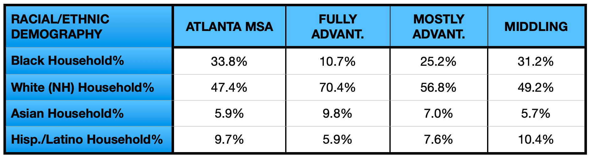
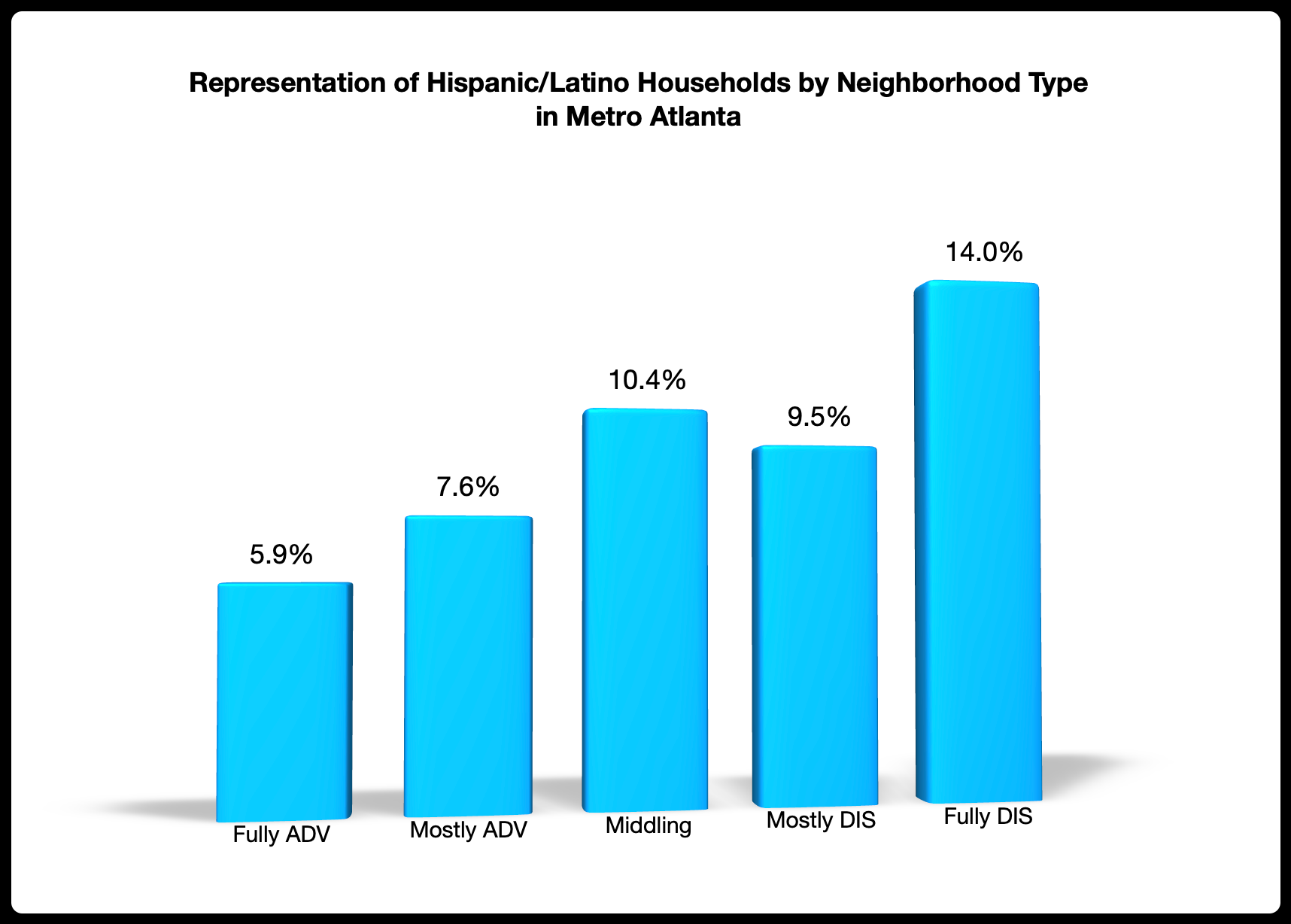
Additionally, we see that the representation of Asian American households increased from 7.0 percent in MST_ADV neighborhoods to 9.8 percent in FL_ADV neighborhoods. On the other hand, the representation of Latino households decreased, from 7.6 percent in MST_ADV neighborhoods to 5.9 percent in FL_ADV neighborhoods. Among the four racial/ethnic groups that together make up more than 95 percent of Metro Atlanta, Latino households were the only ones to show discontinuity in their representation numbers as we journeyed from the most disadvantaged neighborhood types to the most advantaged (see graph below). The other three groups either showed a negative continuity (Black households) or a positive continuity (White and Asian households).
So far in this series, we have traced the geography of neighborhoods and their categories by looking through the county lens. Some of the questions that have emerged are tied to the extent that we see continuity in a county’s share of neighborhoods as we climb the ladder spanning from FL_DIS to FL_ADV neighborhoods. By factoring in the county-level patterns associated with FL_ADV neighborhoods, we can now close the book on these questions and draw some conclusions.
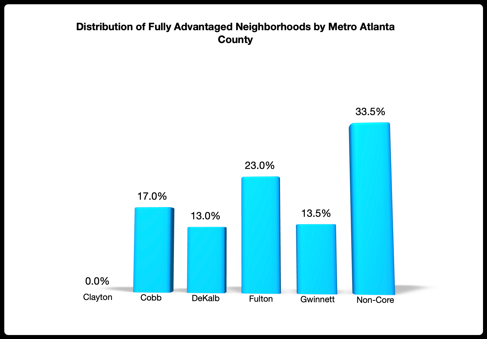
First, we should make note of what the distribution of FL_ADV neighborhoods looks like across the counties of Metro Atlanta. What is especially noteworthy at this point is the relatively large representation of FL_ADV neighborhoods in Fulton County and the fact that there were no FL_ADV neighborhoods present in Clayton County. The 23.0 percent share of neighborhoods found in Fulton County is an uptick from its 20.2 percent share of MST_ADV neighborhoods contained therein and the 0 percent in Clayton County is an obvious downtick from its 0.8 percent share of MST-ADV neighborhoods. When it comes to non-core Metro Atlanta counties we also see a downtick as we climb the economic ladder, with their share of neighborhoods dropping from 38.1 percent in MST_ADV neighborhoods to 33.5 percent in FL_ADV neighborhoods.
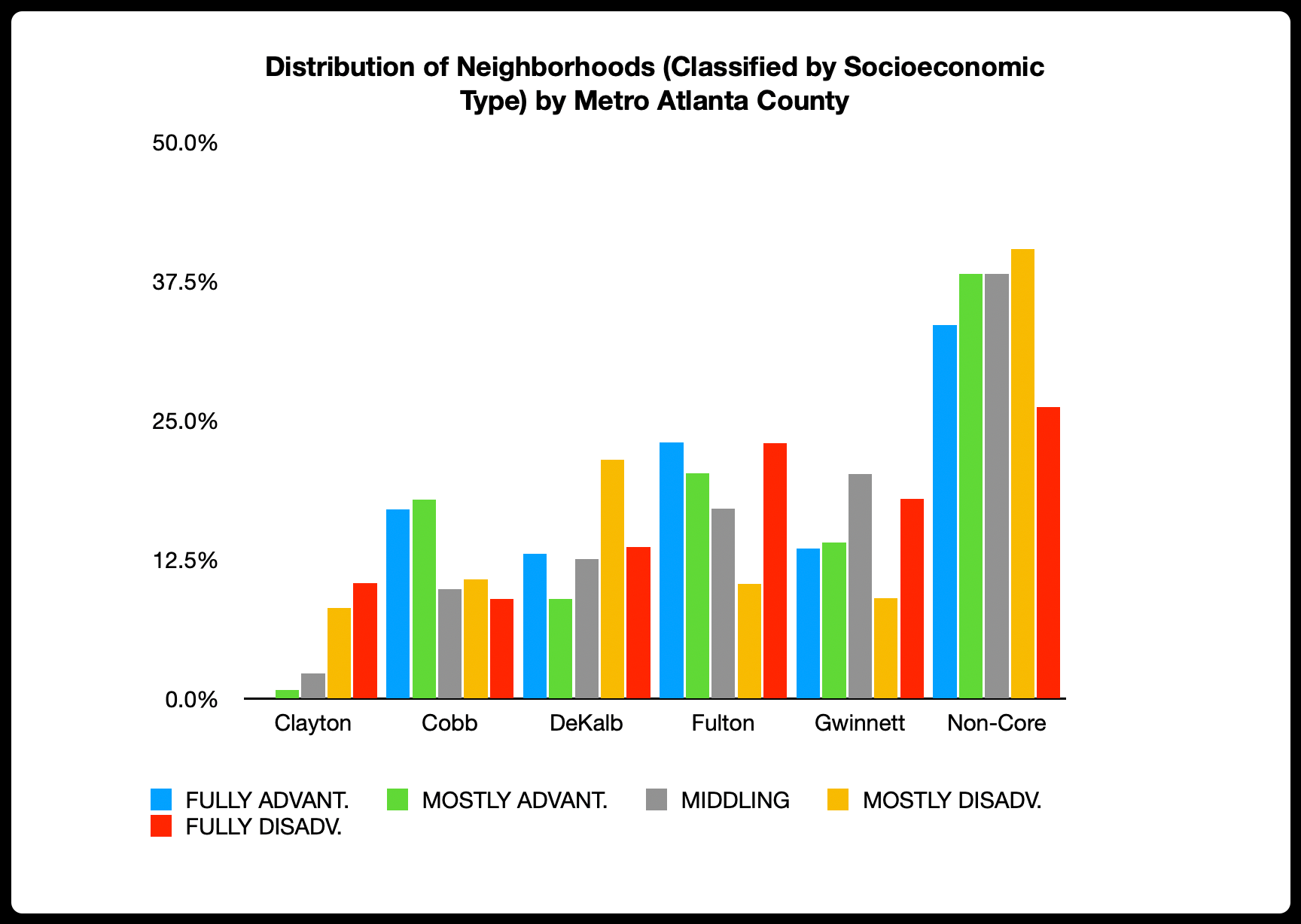
Although somewhat less worthy of note in terms of the strength in the pattern, it is interesting to see the curvilinear nature of the share of neighborhoods found in non-core Metro Atlanta counties. The two counties with the wildest and less continuous pattern in their share of neighborhoods are DeKalb County and Gwinnett County. The overall lack of a pattern in these counties strongly suggests some substantial socioeconomic heterogeneity in these counties. Additionally, although we did note a pattern within its borders, we also see evidence of a good deal of heterogeneity in Fulton County. Comparatively, the same cannot be said for the other singular counties (Clayton and Cobb).
By using the straightforward approach of categorizing neighborhoods by the extent that their socioeconomic statistics better the same statistics at the MSA level, we have learned a great deal about Metro Atlanta neighborhoods. We have seen evidence that the neighborhoods classified at the opposite ends of the spectrum as fully advantaged and fully disadvantaged are quite distinct from their nearest counterparts and, by definition, the rest of the neighborhoods that are a part of Metro Atlanta’s social fabric. For fully disadvantaged neighborhoods, the evidence suggests that this translates to a sense of social isolation that challenges the ability of civic leaders and governing bodies to adequately respond to the needs of these underserved households. In the case of fully advantaged neighborhoods, the findings suggest that residents in these neighborhoods experience a sense of wealth that is very distinct from other neighborhood populations. Their high incomes are complemented by their ownership of homes that yield high market value.
There is no doubt that Metro Atlanta has earned its reputation as an urban area of promise for Black Americans, but this does not mean that Metro Atlanta is immune to historically entrenched patterns of racialization. The primary way we see this playing out is in the overrepresentation of Black households in economically disadvantaged neighborhoods and their underrepresentation in economically advantaged neighborhoods. This striking pattern is mirrored in opposite for White American households, whose representation increases with the degree of economic advantage found in each neighborhood type. Asian American households follow a trajectory similar to the White household trajectory, while Latino households follow a trajectory that is somewhat similar to the Black household trajectory.
The insights generated through this analysis of Metro Atlanta neighborhoods will be carried forward as we wrestle with 2024 American Community Survey data. The strengths and limitations that we have noted on the scorecard approach of categorizing neighborhoods will help us improve our methods and allow us to be more responsive to the granular neighborhood realities that can be missed by simple classifications. We are also looking forward to exploring new metro areas and asking new questions.
Be sure to keep in touch with us and our evolving work by hitting that subscribe button.
Until next time…