
Metro Atlanta’s Five Neighborhoods: Fully Disadvantaged Neighborhoods
Our next and final series solely dedicated to Metro Atlanta neighborhoods will focus on Metro Atlanta’s five neighborhood types as revealed by our Core Socioeconomic Realities dataset framework. This framework analyzes Metropolitan Statistical Area (MSA) neighborhoods through a comparative lens that lines up neighborhood-level socioeconomic statistics with MSA-level statistics. Based on how the results unfolded, we found it logical to focus on five neighborhood types based on how neighborhoods scored against MSA-level metrics.
Fully disadvantaged neighborhoods are those that did not score any points against MSA-level statistics on any of the four socioeconomic metrics we used for Kiaspo’s Socioeconomic Realities Scorecard. Later, we will see that this is not arbitrary. It reflects something significant about these neighborhoods that should spark concern and inspire action among souls working to realize greater measures of equitable prosperity.
[caption id align="alignnone" width="1936"]
US Census Bureau. 2023. “American Community Survey, Five Year Estimates.” [/caption]
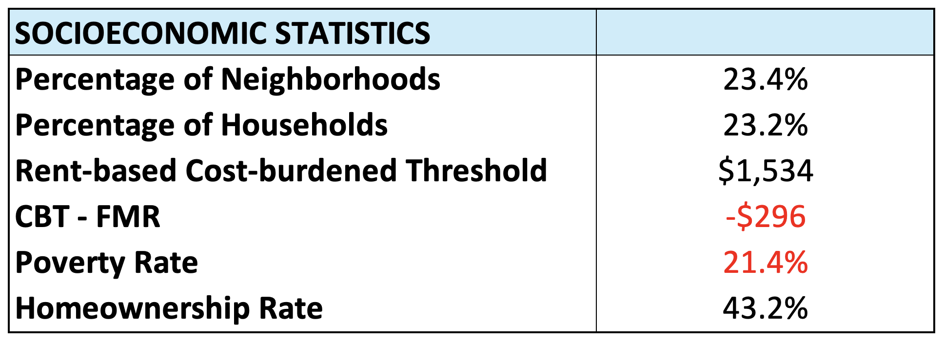
First of all, it is noteworthy that fully disadvantaged neighborhoods make up the highest percentage of neighborhoods across the five categories and these neighborhoods are also home to the highest percentage of households (see table above). Mostly advantaged neighborhoods are second on the list when it comes to both measures. On average, neighborhood residents in fully disadvantaged neighborhoods can afford to pay $1,534 in rental costs without being cost-burdened, which is $296 short of 2025 Fair Market Rent for the Atlanta MSA. Additionally, fully disadvantaged neighborhoods have an average poverty rate of 21.4 percent, which is above the national neighborhood poverty standard (20 percent) and more than double the average poverty rate for the MSA (10.5 percent). Lastly, the homeownership rate for these neighborhoods is below 50 percent and more than 20 percentage-points below the homeownership rate for the Atlanta MSA (67.1 percent).
[caption id align="alignnone" width="1902"]
US Census Bureau. 2023. “American Community Survey, Five Year Estimates.” [/caption]
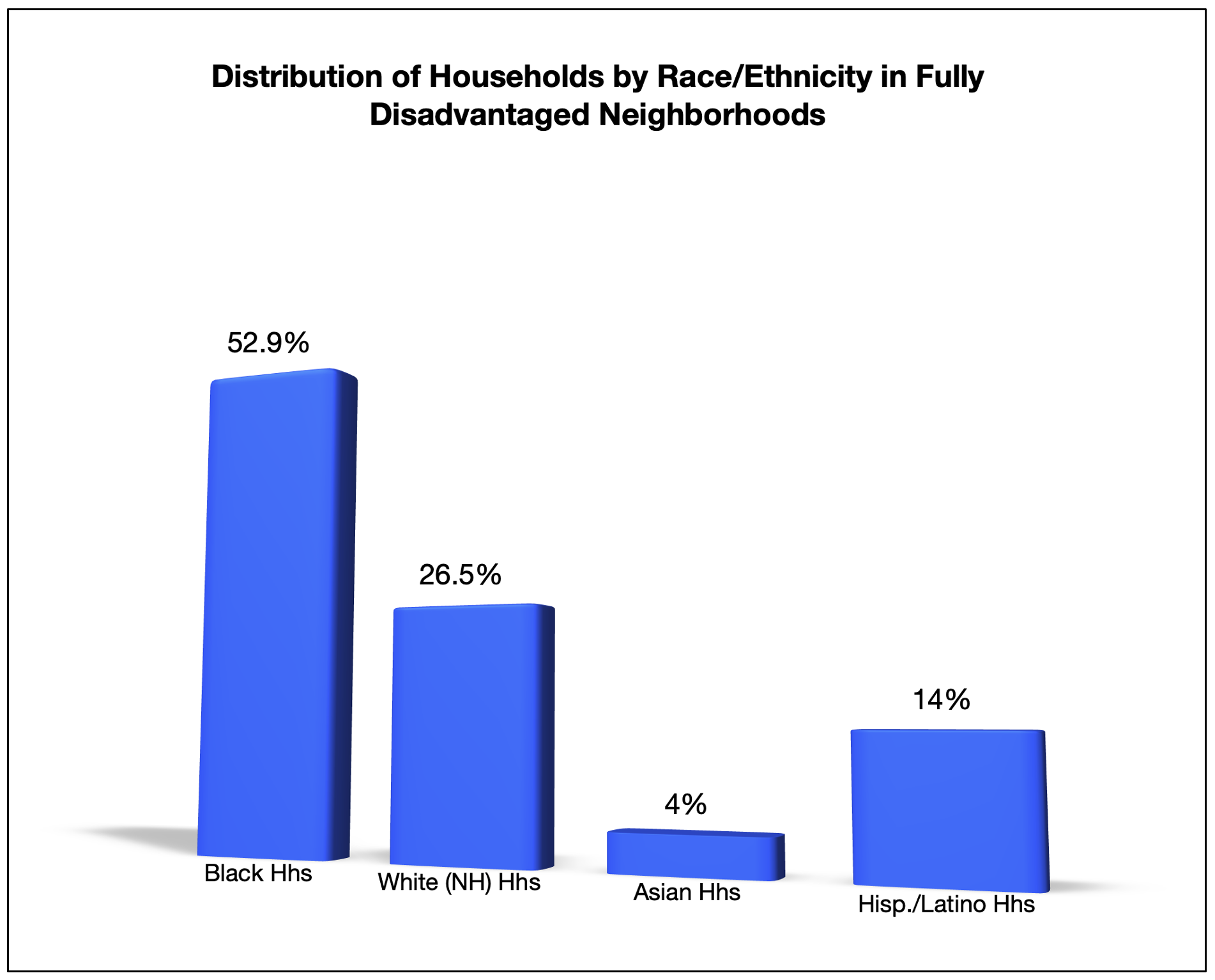
When it comes to the racial/ethnic demography of fully disadvantaged neighborhoods, they are majority-Black, on average (see graph below). The percentage of Black households residing in fully disadvantaged neighborhoods exceeds their general representation in Metro Atlanta (33.8 percent) by nearly 20 percentage-points. Using the same metric, the percentage of White (non-Hispanic) households living in fully disadvantaged neighborhoods is more than 20 percentage-points lower than their Metro Atlanta representation (47.4 percent). Similar to White households, Asian households are also underrepresented in fully disadvantaged neighborhoods. The pattern for Latino households follows the Black household pattern, with their numbers being overrepresented in fully disadvantaged neighborhoods.
[caption id align="alignnone" width="2350"]
US Census Bureau. 2023. “American Community Survey, Five Year Estimates.” [/caption]
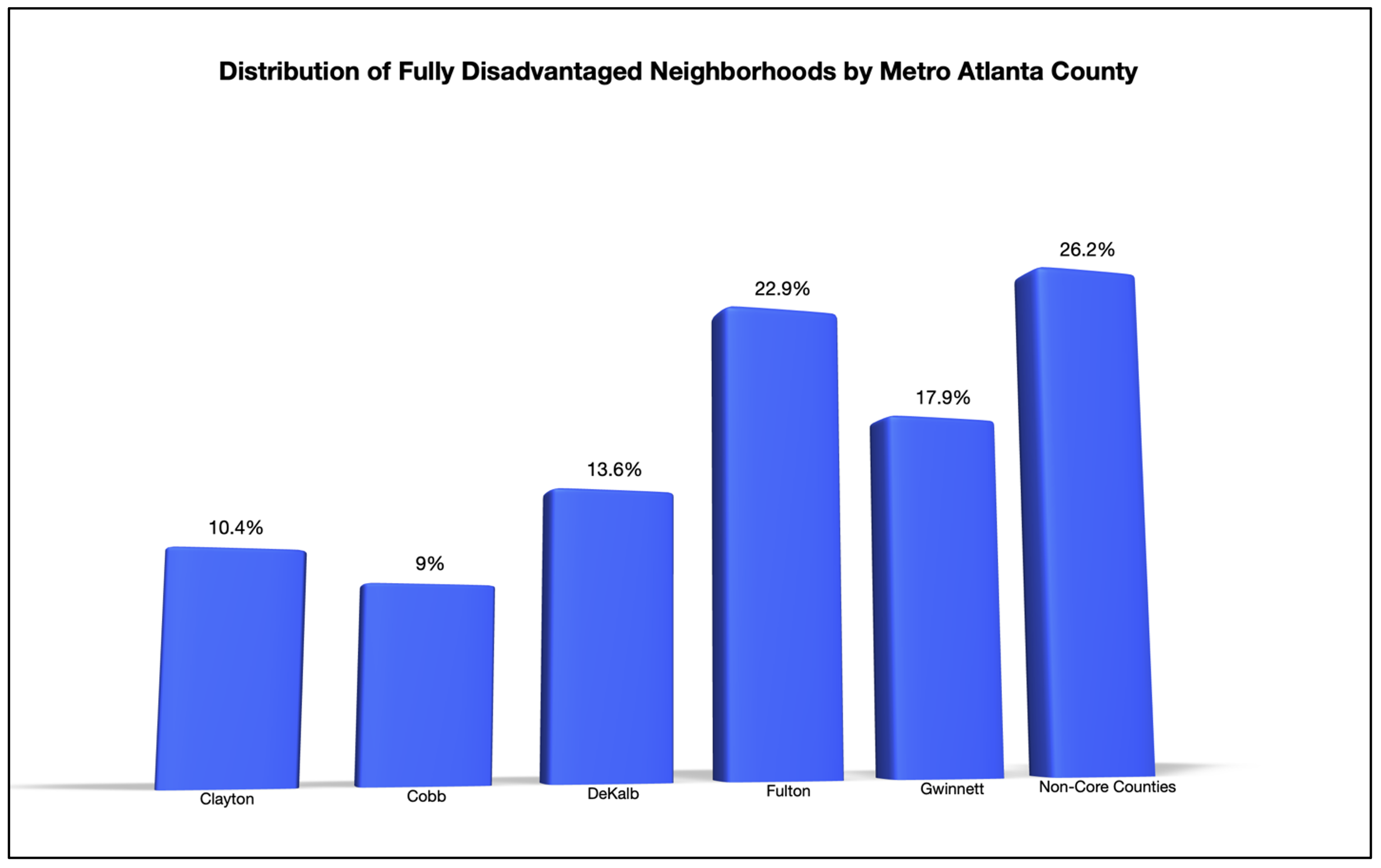
The county-focused lens offers another perspective on fully disadvantaged neighborhoods in Metro Atlanta. The data shows that more than 1-in-5 of these neighborhoods (22.9 percent) are in Fulton County and another 26.2 percent are in counties outside of Metro Atlanta’s core counties. In comparison to the other neighborhood types, this 26.2 percent represents the lowest concentration of neighborhoods in non-core counties. This pattern suggests socioeconomically disadvantaged neighborhoods are concentrated in Metro Atlanta core counties.
When it comes to core county patterns, this data shows the first indication of Fulton, DeKalb, and Gwinnett counties’ socioeconomic diversity and the relative sameness of Clayton County and Cobb County. With respect to the latter counties, the concentration of neighborhoods lowers in Clayton County as you go up the socioeconomic ladder, while the concentration of neighborhoods increases in Cobb County as you go up.
If you would like to join this ongoing conversation about the connection between neighborhoods realities and equitable prosperity, you can connect with us here.