
Metro Atlanta’s Five Neighborhoods: Middling Neighborhoods
So far, I have discussed mostly disadvantaged and fully disadvantaged neighborhoods in Metro Atlanta and how both neighborhood types relate to each other. On the next rung of the socioeconomic ladder are middling neighborhoods. Middling neighborhoods are those that better Metropolitan Statistical Area (MSA) measures on exactly two metrics. The most common combination in this respect was the homeownership rate-and-poverty rate combo (48.0 percent of all occurrences), in which neighborhoods had higher-than-MSA homeownership rates and lower-than-MSA poverty rates.
In terms of differences between neighborhood types, middling (MIDL) neighborhoods are in closer proximity to mostly disadvantaged (MST_DIS) neighborhoods than MST_DIS neighborhoods are to fully disadvantaged neighborhoods (see table below). This finding reinforces heartfelt concerns about the social conditions facing households living in fully disadvantaged (FL_DIS) neighborhoods. Unfortunately, the facts and figures indicate that these neighborhoods are not only impoverished, but also suffer the negative impacts of being isolated from the larger metro and having a population base that lacks an ownership stake in the places they call home.
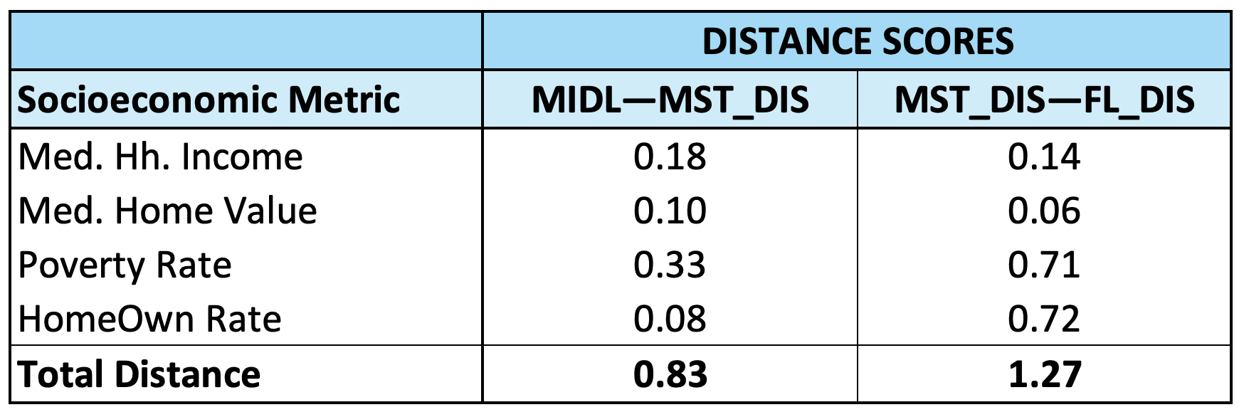
Going back to the distance calculations, it is interesting to note the longer and shorter distances when the MIDL—MST_DIS relationship is compared to the MST_DIS—FL_DIS relationship. The results show that the distance between the median household income and median home value numbers is comparatively greater in the case of the MIDL—MST_DIS relationship. This finding is especially interesting given the fact that these two metrics are the ones most closely tied to household wealth. Conversely, the poverty rate and homeownership rate differences between MIDL and MST_DIS neighborhoods are substantially more moderate in comparison to the MST-DIS—FL_DIS relationship. These patterns are further substantiated when we look at the statistics behind the distance scores (see table below).
[caption id align="alignnone" width="2156"]
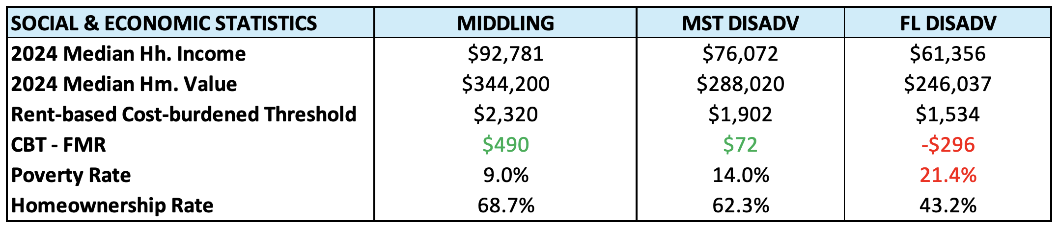
US Census Bureau. 2023. “American Community Survey, Five Year Estimates.” [/caption]
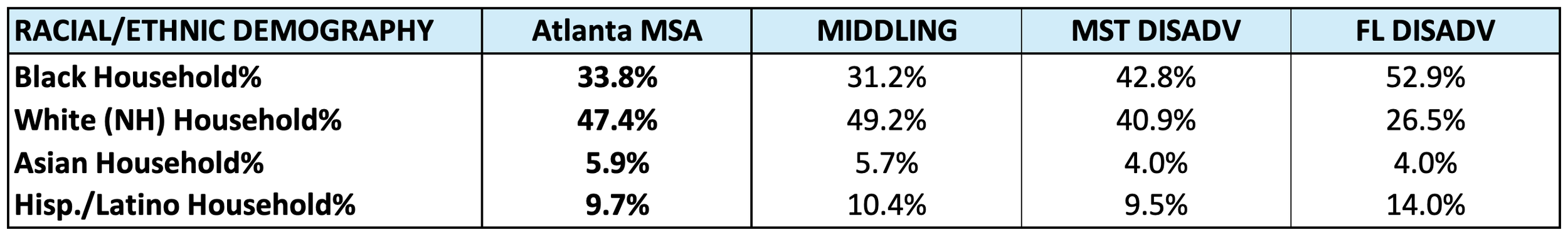
In terms of racial/ethnic demography, the findings make it clear that the distribution of households for each group in MIDL neighborhoods most closely mirrors the racial/ethnic distribution for Metro Atlanta in general (see table below). However, some patterns that must be noted are the trend reversal for Black American and White American households, the trend continuance for Asian American households, and the lack of a trend for Latino households.
[caption id align="alignnone" width="2700"]
US Census Bureau. 2023. “American Community Survey, Five Year Estimates.” [/caption]
Specifically, the trend of Black overrepresentation and White underrepresentation in the neighborhood types reviewed so far is reversed in MIDL neighborhoods. Here, Black households are slightly underrepresented and White households are slightly overrepresented. At the same time, Asian American households continue the trend of being underrepresented in each neighborhood category, which signals their overrepresentation in the advantaged neighborhood categories. Latino households show a lack of a definitive trend at this stage; their numbers show an overrepresentation in FL_DIS and MIDL neighborhoods but show a slight underrepresentation in MST_DIS neighborhoods. This finding, along with the others, set up an intriguing foreshadowing for how racial/ethnic household dynamics will play out in the economically advantaged neighborhoods.
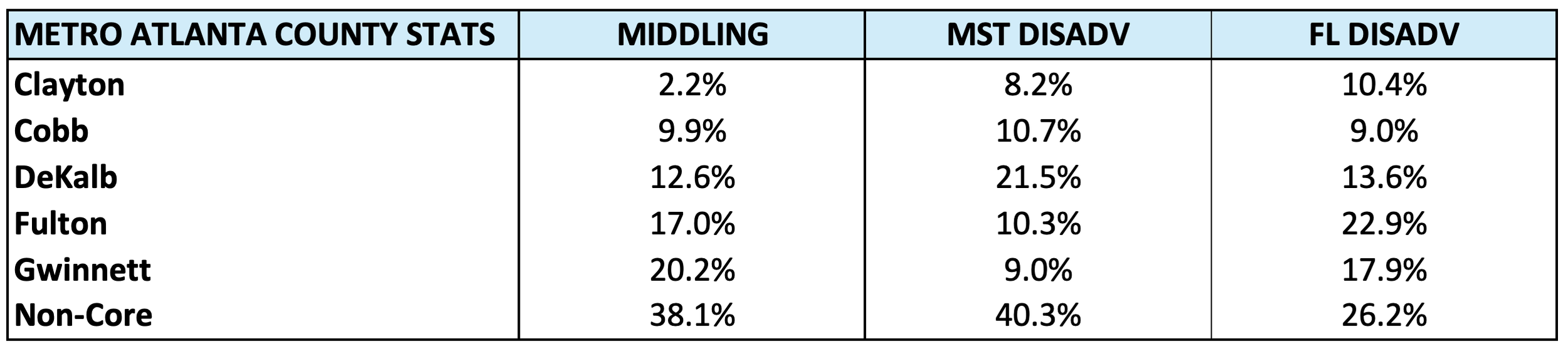
Previously, we noted some interesting patterns with respect to how each group of neighborhoods are distributed by Metro Atlanta counties. Generally speaking, we noted continuities in the patterns associated with the non-core counties and Cobb and Clayton counties. We also noted the lack of continuities in DeKalb, Fulton, and Gwinnett counties.
[caption id align="alignnone" width="2502"]
US Census Bureau. 2023. “American Community Survey, Five Year Estimates.” [/caption]
While a full accounting will be the ultimate judge of the continuities and discontinuities in county-level patterns, the only previously cited continuity that was not disrupted in MIDL neighborhoods is the decreasing share of neighborhoods found in Clayton County as we climb the socioeconomic ladder (see table above). We see in both Cobb County and the non-core counties a slight drop in their share of neighborhoods in MIDL neighborhoods, which contrasts with the trend of increasing shares to this point. However, the discontinuous pattern in DeKalb, Fulton, and Gwinnett counties—mentioned in previous blogs—is fully revealed by including MIDL neighborhoods into the mix. In these three counties there are significant swings in their share of neighborhoods as we scale the socioeconomic ladder.
As the middle neighborhoods, the patterns tied to middling neighborhoods tell us a lot about the underlying dynamics of a metro. Some of these dynamics speak to race and ethnicity, and some speak to baseline economic and geographic factors. The opportunity of applying this core socioeconomic framework further opens the door to identifying specific neighborhoods, becoming familiar with how they are positioned relative to the MSA, and learning about the social characteristics of the residents living there.
If you would like to find out more and continue with this series, be sure to connect with us here.