
Metro Atlanta’s Five Neighborhoods: Mostly Disadvantaged Neighborhoods
Previously, I explained the differences between mostly disadvantaged neighborhoods and fully disadvantaged neighborhoods in Metro Atlanta. Outside of mostly disadvantaged neighborhoods being distinguished for gaining one statistical foothold relative to their metro area—versus none—several other characteristics were detailed. Most outstanding in this regard were the geometric distances between the four core metrics used in Kiaspo’s Core Socioeconomic Realities Scorecard.
[caption id align="alignnone" width="2968"]
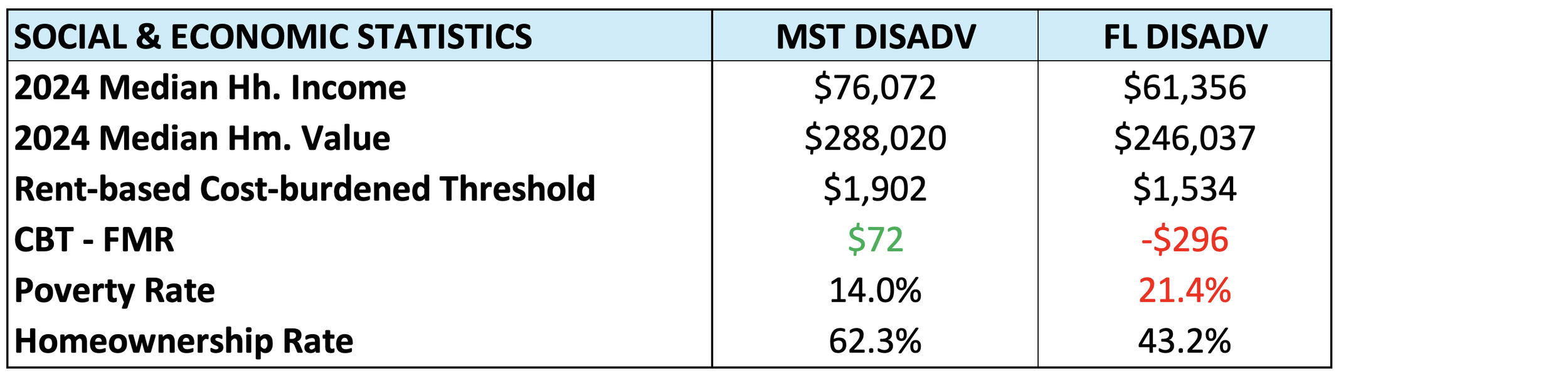
US Census Bureau. 2023. “American Community Survey, Five Year Estimates.” [/caption]
When we take a deeper dive into mostly disadvantaged neighborhoods, it becomes clear that the more abstract distinctions reported earlier coincide with differences that are more directly felt by neighborhood residents. For example, residents in mostly disadvantaged (MST DIS) neighborhoods can generally afford to pay Fair Market Rent (see table above), which is not the case for residents in fully disadvantaged neighborhoods. Additionally, there is a clear difference in the percentage of households living below the poverty line, resulting in the average MST DIS neighborhood falling outside of the official definition of a poor neighborhood (20 percent or higher poverty rate) and fully disadvantaged (FL DIS) neighborhoods falling firmly within it.
[caption id align="alignnone" width="2274"]
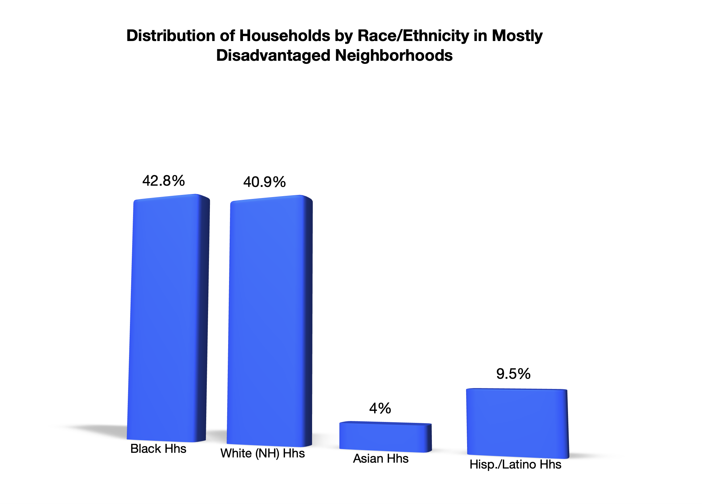
US Census Bureau. 2023. “American Community Survey, Five Year Estimates.” [/caption]
With respect to racial/ethnic backgrounds, MST DIS neighborhoods are on average racially mixed, with Black American households slightly outnumbering White American households. In comparison to their respective numbers in FL DIS neighborhoods, the representations of both groups in MST DIS neighborhoods come substantially closer to their general representation in Metro Atlanta as a whole (see table below). Along the same lines, it’s interesting to note that the representation of Asian American households stays the same in both neighborhood contexts, while there is a bit of a flip for Latino households, where their representation in MST DIS neighborhoods dips lower than their general MSA numbers when they were overrepresented in FL DIS neighborhoods.
[caption id align="alignnone" width="3000"]
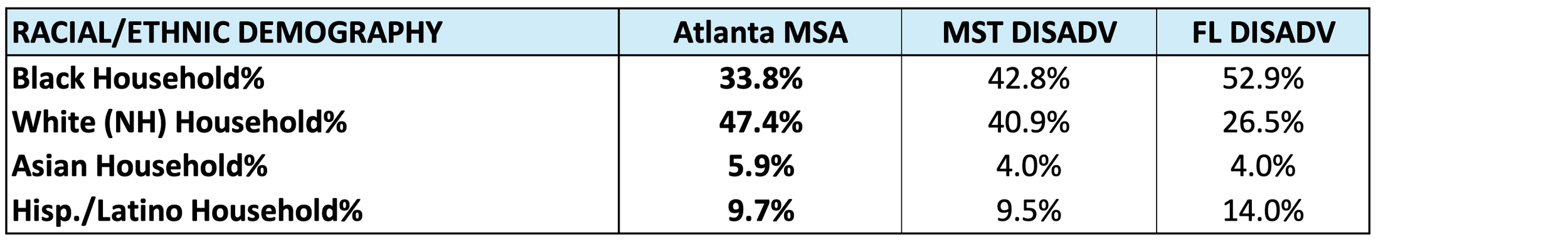
US Census Bureau. 2023. “American Community Survey, Five Year Estimates.” [/caption]
The county-based lens shows a substantial increase in the number of neighborhoods located in non-core Metro Atlanta counties. The 40.3 percent of MST DIS neighborhoods found in in non-core counties is a notable jump from the 26.2 percent of FL DIS neighborhoods located there. Another notable pattern (see graph below) that will become clearer as we go is the decreasing number of neighborhoods in Clayton County (from 10.4 – 8.2 percent) and the increasing numbers in Cobb County (from 9.0 percent to 10.7 percent). The pattern for the remaining counties (DeKalb, Fulton, and Gwinnett) is more variable in these neighborhoods and those to come.
[caption id align="alignnone" width="2530"]
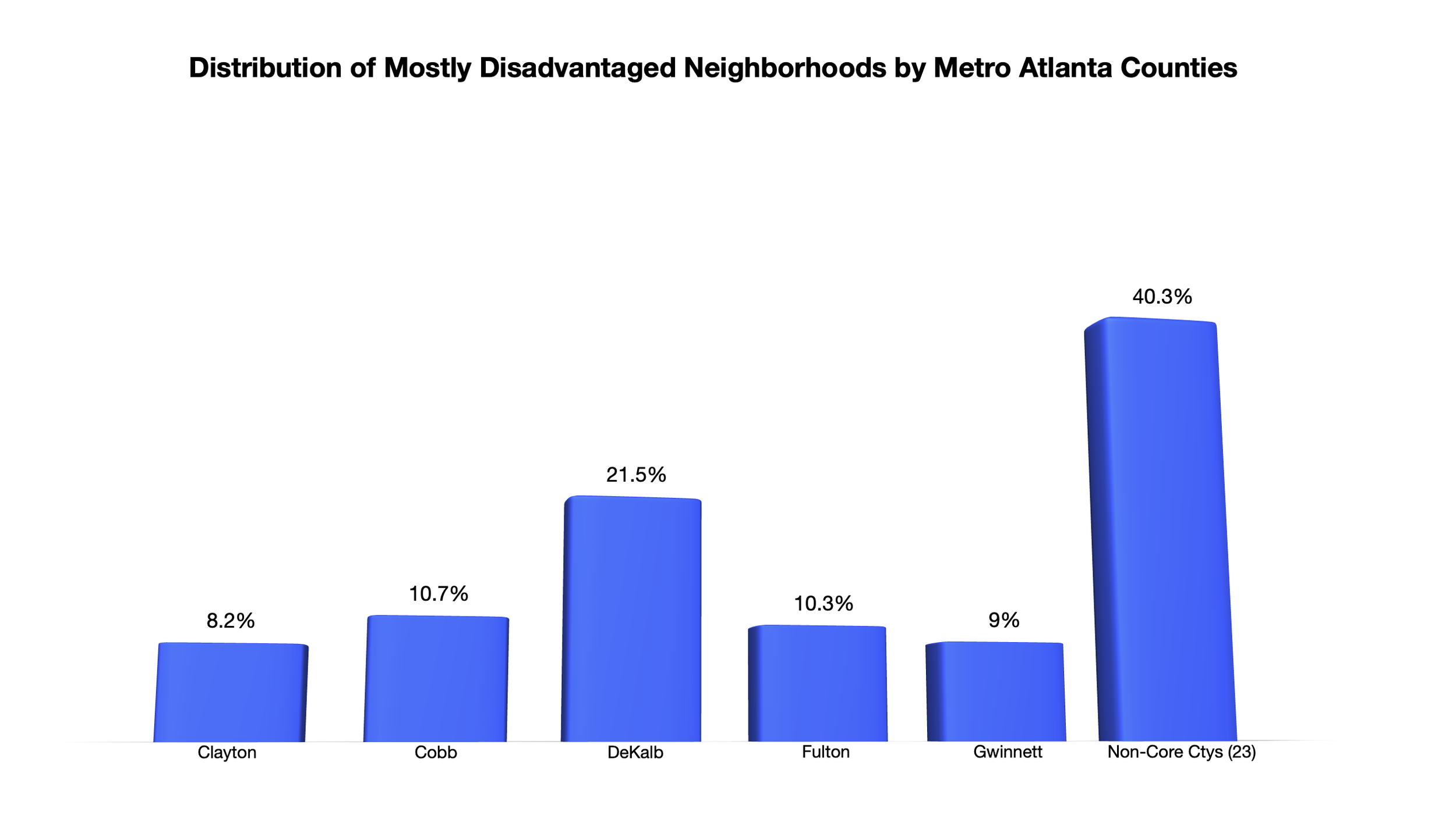
US Census Bureau. 2023. “American Community Survey, Five Year Estimates.” [/caption]
Next, we will explore middling neighborhoods by spending a bit of time comparing them to mostly disadvantaged neighborhoods and then teasing out the details that make this neighborhood type unique. If you’re interested in joining a deeper conversation about these findings and those that will be revealed, be sure to tap in with us here.