
Socioeconomic Metrics Separating Mostly Disadvantaged Neighborhoods from Fully Disadvantaged Neighborhoods
Imagination is a powerful thing. It seeds possibilities that move us beyond dispiriting status quos and galvanizes transformative action. In support of the imaginative souls who are troubled by the current state of housing yet committed to seeing greater equity in this realm—I am spearheading a service that provides organizations with reliable neighborhood data that is useful for wrangling with contemporary issues. Specifically, these datasets shed light on issues such as housing costs-to-income deficits, the socioeconomic viability of proposed housing developments, and gaps in the availability of housing for those earning below-median incomes.
Previously, we evidenced some of the capabilities of our frameworks by exploring fully disadvantaged neighborhoods in Metro Atlanta by looking at their core socioeconomic figures, racial/ethnic demography, and their county-level distribution. Our Core Socioeconomic Realities framework was used to analyze neighborhood-level data through the lens of the realities prevailing at the Metropolitan Statistical Area (MSA) level. As a result, we identified fully disadvantaged neighborhoods as those that did not gain a single foothold when their statistical profiles were compared against the profile of the larger MSA.
[caption id align="alignnone" width="2706"]
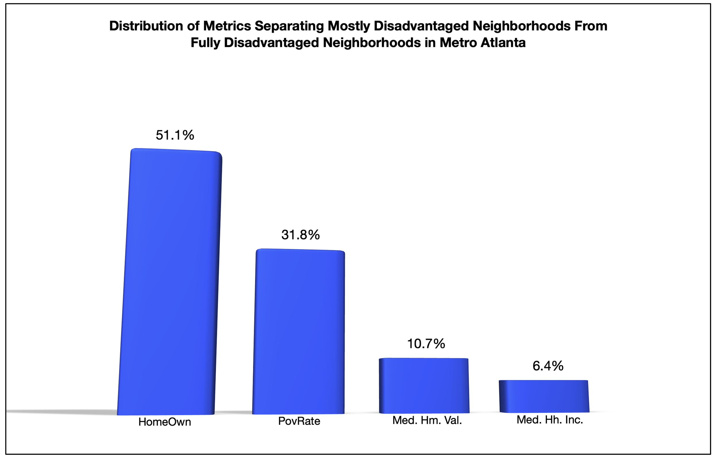
US Census Bureau. 2023. “American Community Survey, Five Year Estimates.” [/caption]
A step above the 279 fully disadvantaged neighborhoods are 233 mostly disadvantaged neighborhoods, which are characterized as such due to surpassing MSA-level statistics on exactly one metric. As the graph above shows, in the majority of cases (51.1 percent) mostly disadvantaged neighborhoods have gained a single foothold by way of higher-than-MSA homeownership rates (119 cases). In over 30 percent of the cases, this single foothold is lower-than-MSA poverty rates (74 cases). The instances in which a single foothold can be tied to median household income or median home values is less than 18 percent, but it is interesting to note that the home value instances (25) are greater than the household income instances (15).
The scale of separation between mostly disadvantaged and fully disadvantaged neighborhoods gets even clearer when we use the broader perspective offered by applying Euclidian distance principles. When we view these neighborhood types as existing in a geometric space with their closeness to one another based on straight-line distances, we’re able to gain a more complete understanding of the differences and similarities between them.
[caption id align="alignnone" width="2166"]
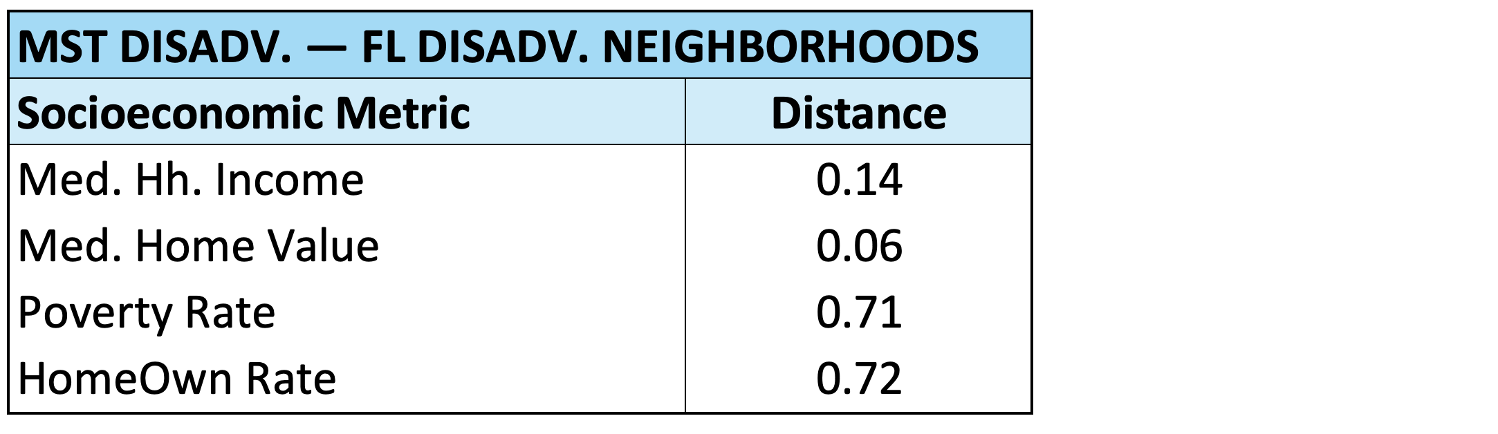
US Census Bureau. 2023. “American Community Survey, Five Year Estimates.” [/caption]
The results from calculating these distances both reinforce the singular foothold-based findings and offer some contradictory evidence. The table above reinforces that the metric that most separates mostly disadvantaged neighborhoods from fully disadvantaged neighborhood is the rate of homeownership (0.72 units), yet it also shows that the poverty rate metric has a very similar distance score (0.71 units).
Additionally, the distance calculations reinforce that there is commonality between homeownership rate and poverty rate as frequent points of separation and household income and home values as less frequent points of separation between the neighborhood types. However, the distance scores contradict the ‘singular foothold’ findings by showing that the distance between the median home values of the neighborhood types (0.06 units) is shorter than the distance between their median household incomes (0.14 units). This indicates that disadvantaged neighborhoods with higher-than-MSA median home values are true outliers within the relational structure binding neighborhoods to the larger metropolitan area.
If you’re interested in joining a deeper conversation about these findings, be sure to tap in with us here.